The Matching Furniture Myth: Why Contrast Can Help
Matching furniture need not come as a set. Use repeated finishes, balanced proportions and one deliberate contrast to make a room feel coherent.
Matching furniture does not have to come from the same set: a room can feel coherent when a few details repeat and one piece deliberately differs. The matching furniture myth treats a shared finish as the only route to unity, yet a room assembled from identical tables and chairs can feel more like a showroom than a home. The more useful question is not whether every piece matches, but what makes the differences look intentional.
What makes a room cohere
Furniture relates through several visible qualities: colour, material, shape, scale and spacing. Two pieces may share a warm wood tone while having different silhouettes; a painted table and an upholstered chair may connect through a repeated dark accent. No single quality needs to match everywhere. A room gains rhythm when a few features recur, leaving the eye enough variation to keep moving.
Think of repetition as a thread, not a uniform. It might be a recurring curved edge, a dark metal detail, or a family of muted colours. If these cues appear in more than one place, a contrasting piece can feel like part of the composition rather than a stray purchase. Repeating every feature, on the other hand, can flatten the room: there is nowhere for the eye to pause.
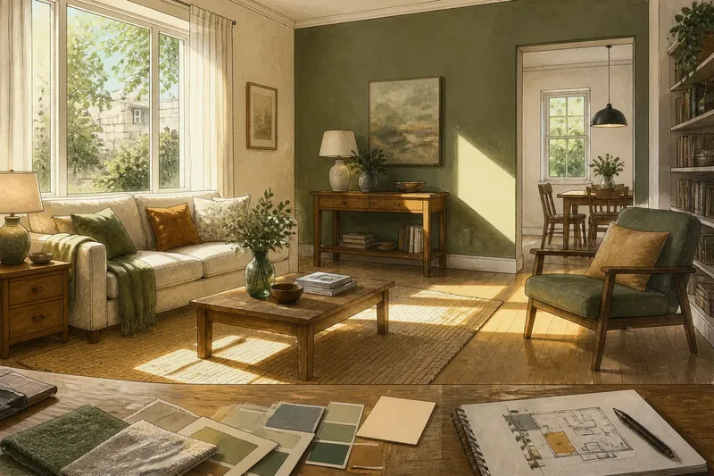
Start by noticing what is already repeated. The floor, a built-in cupboard, a favourite chair or a framed print may provide the room’s existing palette and shapes. New furniture can respond to those elements instead of arriving as a matching package.
Choose a visual thread
Before bringing in a contrasting piece, identify one or two details that can link it to its surroundings. A walnut side table beside a pale oak sofa frame might connect through a similar warm undertone, while a black lamp base echoes dark handles elsewhere. The aim is not exact agreement; it is a relationship the eye can recognise.
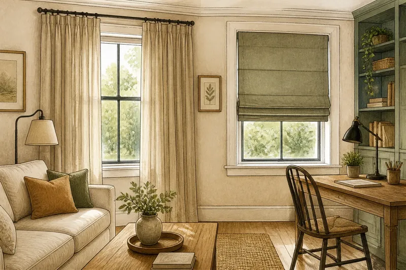
Material alone can be a useful thread. A glass-topped table can sit comfortably among timber furnishings if its base repeats a metal finish already present in the room. A linen-covered chair can relate to a plain wooden desk through shared colour, even though their textures and forms differ. Keep the link visible rather than relying on a hidden similarity only you know about.
- Repeat a finish: let a metal, wood tone or painted colour appear on more than one item.
- Echo a shape: connect a rounded table edge with a curved chair back or arched cabinet detail.
- Carry a colour: repeat a restrained shade in upholstery, a lamp or a small object.
- Balance texture: place a smooth surface near a tactile one, then repeat one of their colours.
One clear thread usually reads more confidently than several competing ones. If every piece introduces a new wood, colour and shape, the room can look accidental even when each item is attractive on its own.
Read proportion and scale
Proportion is often the quiet reason a mix works—or feels awkward. A low, broad coffee table beside delicate high-legged chairs may create an uneasy mismatch, even if their finishes share a colour. Look at the furniture’s visual weight: the amount of space it occupies, the thickness of its parts and how much of the floor or wall it obscures.
Compare pieces from the usual viewing position, not only up close. A tall bookcase can balance a substantial sofa across the room, while a small side table may disappear next to a deep armchair. Similar heights can help furnishings relate, but they need not be identical. A deliberate difference in height can add movement when the rest of the arrangement gives it a counterpart.
Allow negative space to take part in the composition. A slim-legged table leaves more floor visible than a solid block; that difference can help a room with several weighty pieces feel less crowded. Before deciding that two furnishings clash, consider whether their spacing, rather than their style, is the problem.
Give contrast a clear role
A contrasting piece works best when it has a job in the room’s visual story. It might bring a darker note to a pale arrangement, add a sculptural shape among straight lines, or introduce a softer material beside hard surfaces. A contrast without a role can look like an interruption; one that answers a need in the composition feels deliberate.
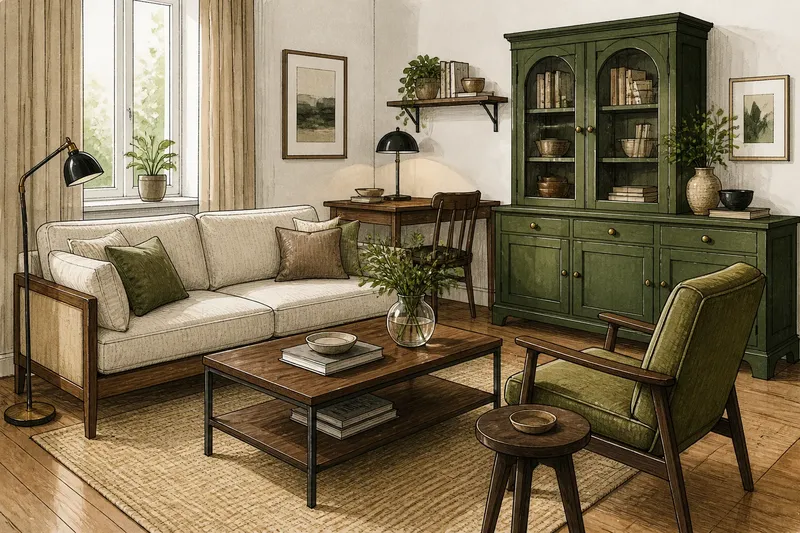
Say you have a pale timber dining table, simple chairs and a plain white wall, but the dining area feels washed out. Imagine adding one deep green painted cabinet, then repeating that green in a small framed print elsewhere in the room. The expected visual result is a distinct focal point that still has a connection to its surroundings, rather than a lone block of colour.
Keep the contrast concentrated. If the cabinet is the strongest colour, let nearby pieces remain quieter; if a chair has an unusual outline, avoid surrounding it with several equally prominent shapes. Contrast needs breathing room to register. It does not need to be dramatic: a single dark timber stool among paler pieces can provide enough definition.
When should furniture match?
Is a matching furniture set a mistake?
No. A set can be a sensible choice when its scale and function suit the room, and it may offer a calm starting point. The useful distinction is between choosing a set because you like its character and assuming every later addition must copy it.
How many wood finishes can a room hold?
There is no fixed count that suits every space. Look for a shared undertone or a repeated finish, then judge whether each surface has enough visual company to feel connected rather than isolated.
Can different furniture styles work together?
Yes, if something links them, such as proportion, colour, material or a repeated shape. A contemporary table and a traditional chair can sit together more easily when their visual weight feels balanced and one detail echoes across both.
What if a contrasting piece looks out of place?
Check its position and the details around it before replacing it. A nearby repeated colour or a more generous gap may help it belong; if it still competes with the room, reduce other strong accents so it is not fighting for attention.
Make changes in context
Furniture rarely makes sense in isolation. A chair viewed against a wall, rug and sofa can look quite different from the same chair in a shop or online image. Move a candidate into the room if possible, or use a paper outline to judge its footprint and a fabric or finish sample to compare colour in place. These checks help assess context without demanding that every surface match.
Keep the room’s everyday use in view. A beautiful accent table that blocks a walking route will not feel successful for long. Likewise, a delicate finish may be an unwise choice in a spot where bags, cups or toys regularly land. The best contrast is one that contributes visually while remaining suitable for the task.
When the right choice depends on care labels, maker guidance or local requirements, follow those instructions rather than general decorating advice. That matters particularly when combining materials that need different cleaning methods or furnishings intended for a specific use.
Build a composed mix
Try assessing the room in three passes. First, name the features already repeated: perhaps warm wood, rounded corners and a dark accent. Next, look for a gap in the composition: a missing height, a need for storage, or an area that feels too uniform. Finally, consider a piece that answers that gap while sharing at least one of the room’s existing visual threads.
This is not a formula for collecting furnishings by theme. It is a way to make choices with the whole room in mind. A contrasting piece should bring something useful, whether that is function, colour, texture or shape; the repeated details help it join the conversation.
The matching furniture myth fades once you look for relationships instead of identical finishes. Choose one clear point of contrast, give it a visible connection elsewhere and check its scale in the room. Matching furniture can still be the right choice, but it is not the only way to make a space feel settled.
When in doubt, move one piece before buying another: a small change in position can reveal whether the room needs contrast, a repeated detail or simply more breathing space.